
Are you trying to figure out what the big deal is with Infographics and why do so many people use them when you can just as easily explain your message using text? I get asked this at work quite often when I tell colleagues that I prefer using Infographics so I am going to explain what they are and why you should be using them.
What is an Infographic Definition
What exactly is an infographic is? In essence, it’s a visual representation of information, aimed at presenting information quickly and clearly. An infographic uses text, images and graphics to present information in a visually appealing way, this makes it easier for people to understand and retain the key messages and makes infographics a really effective tool for communicating information.
Typically used in marketing, infographics aim to present information. By using color, icons, charts, and other design elements, infographics transform potentially overwhelming data into a easy to understand form. This is not only effective for simplifying complex ideas but also serves as a useful way to share information across various platforms, including social media, presentations, websites, handouts and even signs. Infographics have become an integral part of marketing strategies due to their ability to capture attention and convey messages efficiently in our visually-oriented digital age.
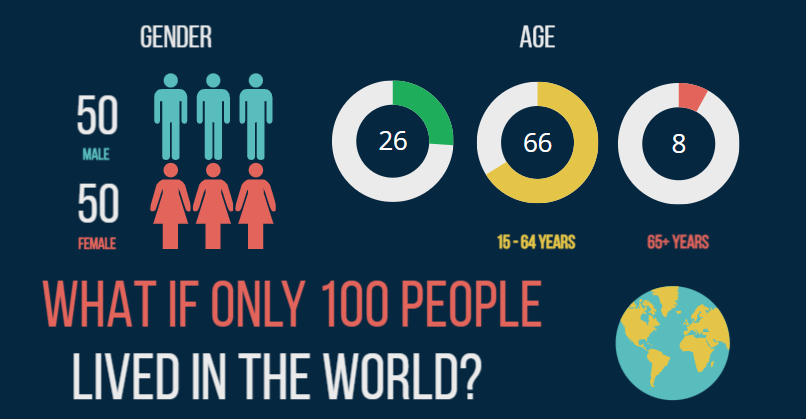
In my opinion, what we’re really talking about here is a tool for compressing lots of information into a single image that allows us to see the whole story in one visual, this is so useful in a world where we have access to so much information but want everything instantly. One of the things that I think causes confusion with Infographics is the huge range of applications they get used for. Some people seem to think they are just for displaying figures and data but this is only one of the many uses.
Why Do Infographics Work
Now, you might be wondering what sets visual data apart from plain text and why do they actually work. It’s simple: our brains are wired to process visual information faster, actually much faster than text alone. This isn’t just about catching your eye; it’s also about efficiency and how we understand and remember information.

Have you ever read a block of text and, moments later, struggle to recall the details? You’re not alone. Research underscores that humans work better with visual information. Studies indicate that visuals are processed 60,000 times faster in the brain than text. That means the information you present in an infographic will be understood and absorbed much faster than the same content in a paragraph form.
One reason infographics pack a punch is because they help with memory retention. It’s a phenomenon known as the ‘picture superiority effect.’ Visuals aid in storing and retrieving information more efficiently than text alone. If you’ve ever used mnemonics to remember data, you’ve experienced this firsthand. Mnemonics are patterns of things like colors or words that help the brain to organize information and make it easier to remember, Infographics act like visual mnemonics, imprinting data into our memory banks by organizing it and making it easier to absorb.
But it’s not just about memorizing; it’s also about understanding complex concepts. In a study by the Wharton School of Business, researchers found that infographics could increase comprehension by up to 50% over plain text. This level of clarity is exactly what you’re looking for when you need your message to hit home.
What is an Infographic Used For
There are so many different ways that infographics have become common place that you probably don’t even realize a lot of the time that you are looking at one, It’s fascinating to see how infographics have become standard practice in many areas of our lives. They get used on posters, leaflets, instruction booklets, presentations and company overviews to name a view. Let’s look at a few of the most common uses:
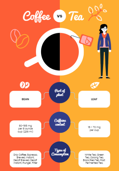
Comparative Infographics – These are one of the simplest infographics and are used when you have two or more items that you want to compare, they’re incredible tools for laying out options side by side so you can easily weigh them against each other. This isn’t just about comparing products; it’s also about exploring different scenarios or solutions, which is particularly handy in business decision-making.
Timeline infographics – These breathe life into historical data, milestones, and events by mapping them out over time. This gives you a way to view progress or understand the sequence of events in a story, making it a favorite in educational settings and project management
Educational infographics – These are widely used in schools and online courses to break down information and make learning engaging. They’re part of the reason why many educational materials are now more visually appealing and effective.
Marketing Infographics – Companies often turn to these to create an image for their brand, some use key messages or standout statistics to make sure that customers remember positive things about their brand. It’s visual marketing, pure and simple, but incredibly powerful.
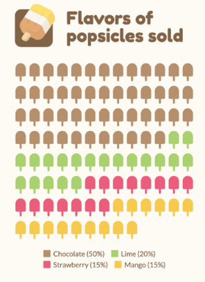
Statistical Infographics – When it comes to presenting research findings or statistics, infographics come to the rescue. they translate numbers and data into a form that’s not only digestible but also tells a compelling story. This is why you’ll find them featured in scientific journals, reports, and policy briefs.
What Is The Best Infographic Creator
Once you understand that Infographics are a much better way to pass on information you are half way there, the next part is actually using them. I know this can seem like a lot of work and you might not even know where to start. I think the main reason that people use plain text is because it is just easier to write something than create an Infographic, don’t worry though as it is much easier than you think. You can read my full post here on how to create your own Infographic for advice on how to choose your content but the easiest way to do it is to simply pick an online Infographic tool and use one of the 1000’s of templates available. The technology is really good now and you can even use AI to create your own bespoke Infographics,
The best Infographic Creators that I have used are:
Piktochart: Piktochart’s AI generator is my top choice for creating infographics. It’s user-friendly, making it ideal for beginners. Simply input your ideas, and the AI generates up to 10 different infographics for inspiration. Select your preferred design, customize as needed, and you’re ready to use it. I’ve tested various AI tools, but Piktochart consistently aligns with my preferences. Be specific for optimal results, but note that the free plan allows only five creations before requiring an upgrade. For more details, check out my comprehensive Piktochart review

Visme: Visme quickly became my preferred infographic tool for data due to it’s integrated widgets for graphs and statistics, providing easy adjustments by simply typing the values you want. It offers comprehensive training and a broad range of infographics. While it’s among the most user-friendly platforms I’ve tested, it follows the trend of limiting free designs to five before requiring a paid plan
Canva: Canva stands out as the most widely recognized design tool, known for its popularity for creating social media visuals with pre-formatted templates for platforms like Instagram and Facebook, it also proves effective for a wide range of design needs, from websites to print products and even book covers. Like Piktochart it also has an AI tool that helps with designing bespoke Infographics.
There are so many more available but the ones above are ones that I have personally used and find really good, between these three I don’t think you will need to look much further.
Best Practice For Infographics
Hopefully by now you are a believer in why Infographics are so much better than using plain text, you should also have decided on a platform to create your Infographics on. The only thing left to do is start creating, BUT, if you want to get the most out of an infographic here is a few tips:
- Keep it simple: Your infographic should present the key information clearly, don’t overload it with too much data or text.
- Use Storytelling: A great infographic guides the viewer’s eye through the narrative or data journey. Make use of clear headers, segments, and visual cues.
- Be Consistent: If you’re using infographics for business, ensure they align with your brand’s look and feel. Consistent use of colors, fonts, and styles helps in maintaining brand recognition.
- You can also read my post on Creating Infographics Free here
Infographics are more than just pretty pictures; they communicate information in a way that plain text just can’t match. With the right tools and a thoughtful approach, your infographics can capture attention, enhance understanding, and leave a lasting impression.
Happy designing and have fun, if you have any feedback on this post or if you have a preferred Infographic platform leave a comment as its great to hear what everyone else is doing too
Pete
Great job! You have made it look so easy talking about that topic, providing your readers some vital information. I would love to see more helpful articles like this, so please keep posting!
Thank you Israel, I really appreciate the feedback as I try to keep my posts as straight forward as possible. Whenever I read posts that sound complicated I switch off so i am really pleased to hear you find mine useful.
Thanks again
Pete