
We are bombarded by information at an amazing rate, from reading the news on apps to social media and presentations at work. Everyday it seems like the level of information we are subjected to is increasing and it is a constant battle to find ways to make it easier to absorb and understand. Businesses are aware of this and are fighting to find ways to communicate messages faster and clearer to combat the information overload we are all experiencing.
Infographics have emerged as a powerful tool in this battle for conveying complex data and ideas with clarity and brevity.

They are visually appealing, can be understood instantly and have become an integral part of our daily lives, from educational materials to marketing campaigns. In this post, I will look at infographics, explore what they are, their benefits, and help you understand how you can create effective infographics that captivate and inform your audience.
What is an Infographic Definition
The best explanation that I have read is:
Infographics or Information Graphics are visual representations of data, information, or knowledge
While this sums up pretty well what an infographic is it doesn’t explain what they are used for, Infographics are basically designed to be a visual representation of information so that when information is displayed this way it makes it much easier for us to understand and interpret it. Creating infographics involves combining a graphic illustration with a limited amount of information to create an image that structures a message really clearly removing the need for additional explanations. Whether you’re presenting data, explaining a complex process, or summarizing key points, infographics can make your content much more appealing and easier to understand.
What are Infographics Used For
Infographics have been used for centuries and there are records of Infographics made up of hieroglyphics and pictograms, they can be used anywhere that you want to deliver a message in a simple and understandable way but are particularly useful when displaying data. Most people will be familiar with infographics but just don’t realize that is what they are looking at.
Some of the main types of Infographics are:
- Statistical Infographics: One of the most common types of infographics as statistics and data are not only boring for most people but can also be hard to understand. Using charts, graphs, and visualizations makes them instantly more understandable and easier to remember
- Informational Infographics: These are used to display a message that needs to be understood quickly and clearly such as a sign. A simple image with a small bit of text is perfect for this, for example if a fast food chain has a menu where you can choose a meat, a base and a topping a simple image displaying this is instantly understandable.
- Timeline Infographics: Chronological events or developments are much easier to visual and understand when displayed as a timeline graphic

- Comparison Infographics: The best way to easily identify differences between two things is to display an image that highlights it.
- Hierarchical Infographics: Everybody has probably seen an organagram at some point as it is a really easy way to display who is in charge of who and where they fit in an organisation.
- Geographic Infographics: These use maps to display location-based data and are one of the best examples of how an infographic can transform data
Do Infographics Work?
Infographics are so versatile that they can be used for so many different applications and they are so common because they really do work. It doesn’t matter if you are delivering information or receiving it, Infographics are better for everyone involved:
- Better Understanding – Infographics simplify even complex information, as most of us work visually we naturally understand images better than text
- Increased Retention – Our brains are wired to remember things we can visualize, most memory techniques involve strategies to visualize information. Displaying it as a visual already increases our memory of it massively
- Higher Engagement levels – When things are quicker to understand this encourages people to engage more often, if a message is complicated most people will take time to understand and won’t feel comfortable engaging in case they misunderstood it. The easier to understand the higher levels of engagement you will get
- Universal Appeal – Infographics can be understood in any language, by people that cannot read and by people of almost any age so they really create appeal for almost everyone
How to Create an Infographic
That all sounds fantastic and you are probably already convinced that you should be using infographics, but HOW do you create them? When it comes to actually creating an infographic you essentially have 3 main options:
- Create your own from scratch – Unless you are very creative and skilled I wouldn’t recommend this option, it can be very time consuming and even after spending a huge amount of time it still won’t look as good as a professional one.
- Use one of the PowerPoint built in infographic templates – this is OK to start with but I find the options quite limited, I regularly would spend ages going through them and then end up using a different system in the end. Now I just skip this step and go straight to option 3
- Use a professional Infographic Template package – if you pick a good one they have 1’000s of templates to choose from and are really easy to use. They will give you ideas you had never considered, are much quicker to create and look really professional. This would be my recommendation in most instances

Creating Infographics
Using a professional Infographic template would be my first choice but you still have to do some of the work yourself if you are going to get the most out of the process, follow these steps when using a template to create your infographic and you will be able to create a visual that really works for you:
- Define the message you want to deliver – you need to do this at the start because everything else will flow from it. What do you want the observer to think, feel, do when they see your image?
- Gather your information
- Choose the type of Infographic – I find that once you know your message if you browse through a good Infographic Template package it will be much easier to identify the type of infographic you want to use
- Add in your information and adjust the template to highlight your main message
If you decide to create your own Infographic from scratch I would still encourage you to look at a template package as they are full of ideas and will help to shape your thought process.
Which Infographic Template Package Should I Use?
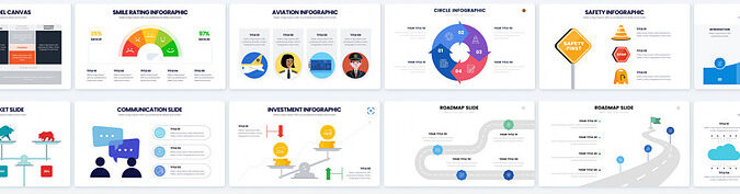
There are literally hundreds of template systems available and many of them have their own unique benefits, I did a review on some of the Best Free Infographic Makers here if you want to check them out but my current favourite and the one I am using is Piktochart as it just has so much to offer including AI integration. You can click the image below to see what Piktochart has to offer

Conclusion
In today’s fast-paced world, infographics really help to transfer information effectively and engagingly. Whether you’re a marketer, educator, journalist, or just looking to communicate data or ideas, understanding the principles of infographics can help you make your message clearer, more memorable, and visually captivating. By using the power of infographics, you will better connect with your audience and leave a lasting impact on everyone that sees them.
I would love to hear what your favourite Infographic template system is to how you use them so feel free to leave a comment below
Pete
I thoroughly enjoyed your insightful post on the power of infographics in presentations. Your points about visual storytelling and its impact on audience engagement are spot on. Have you come across any specific tools or software that you find particularly effective for creating compelling infographics? I’m always on the lookout for user-friendly options. Additionally, your emphasis on the ability of infographics to simplify complex information is crucial. I’ve personally found that incorporating infographics not only enhances understanding but also makes the content more memorable for the audience.
Your mention of infographics fostering a deeper connection with the audience is so true. It’s amazing how a well-designed visual can evoke emotions and leave a lasting impression. Have you ever had a presentation where the use of infographics notably elevated the overall impact? I’d love to hear about that experience. Furthermore, your advice on balancing visuals with text is key. It ensures that the information is accessible and not overwhelming. Your post serves as a valuable reminder of the transformative potential of infographics in effective storytelling presentations. Thank you for sharing these insights!
Hi Pasindu,
Thank you for your feedback, my favourite tool for creating infographics is Infograpia, they have a huge range of pre-made templates and I always get so many good ideas when I look through their range. You simply pick the one you like, download it and add your own info. It is really easy to use and is my go to platform for Infographics.
My best experience with infographics and one that really convinced me how good they are was at work, we had been trying to convince our sales people to stick to the steps of our sales process but several of them kept forgetting 1 step. I created an infographic with the steps on and I was amazed at the response it received, even the most resistant team members said it made it so much easier to remember the process. I use infographics for every project now
Thank again Pasindu and i am really glad you enjoyed the post